
Redesigning the Web Homepage with Clearer Storytelling to Improve Conversion
Company
Popcorn AI Tech Inc.
Current State
Launched
Team
Product Designer (Zane Hu), Product Designer (Sylvia Liu), Product Manager (Eric Liu)

Overview
Product Brief

Ditto
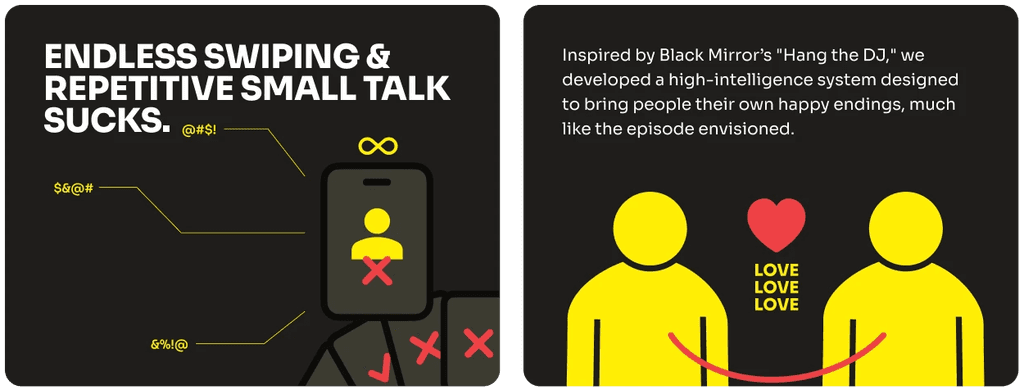
Ditto is an AI-powered dating experience that delivers “ready-to-go” date invites, eliminating endless swiping and small talk.

Objective
💛
Drive higher user conversion by guiding website visitors to start the experience.
Design approach
Restructure the page to help users quickly grasp how the experience works.

Replaced abstract visuals with real UI to give users a clearer, more realistic sense of the actual experience.

Find the simplest and clearest way to communicate Ditto’s core value.

Imapct
+32.3%
Conversion rate increased by 32.3%
🥰
More users clearly understood Ditto’s value and how it works.
Improving Information Flow
I believe that when presenting a new experience, users care most about what it is, how it works, and what value it offers.

However, the original structure of the page did NOT follow this user-centered logic.
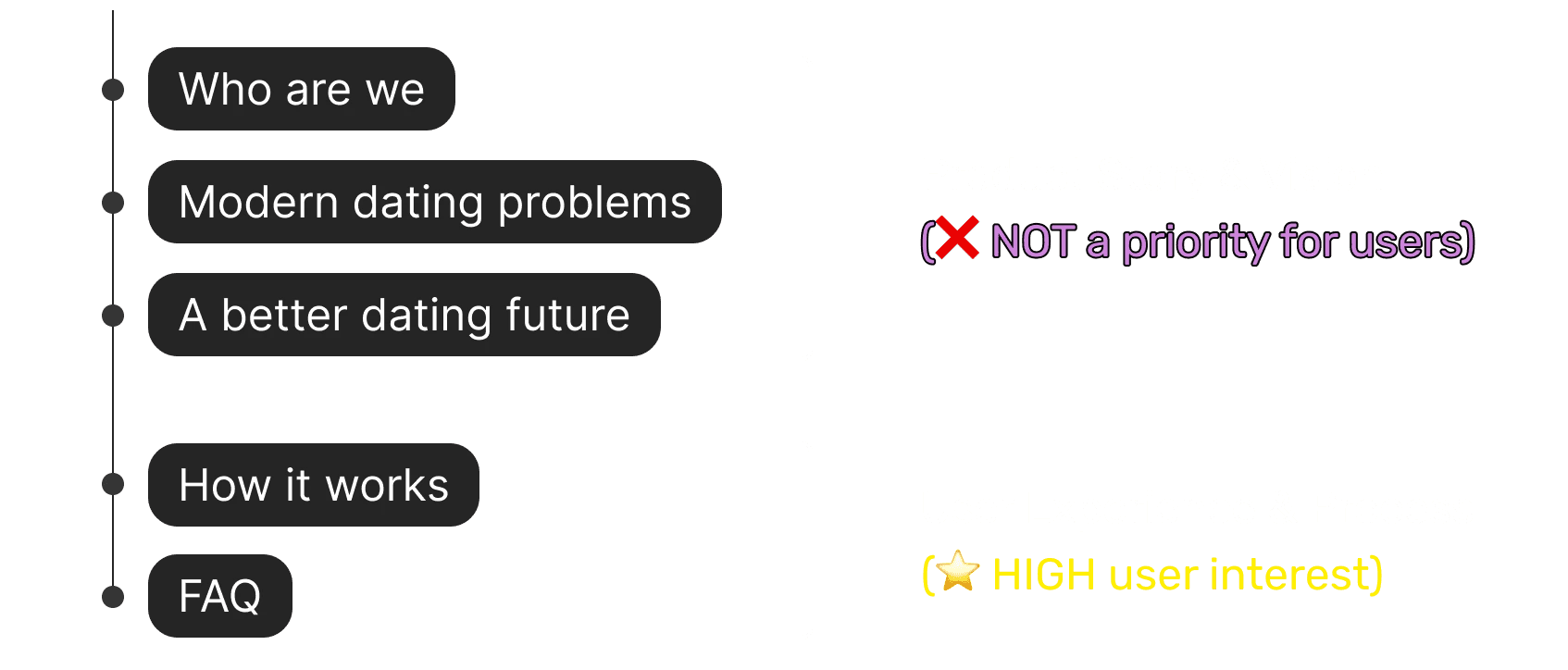
To address this misalignment, I reorganized the homepage structure to better match user priorities.

"How it works" session redesign
Problem
🧐
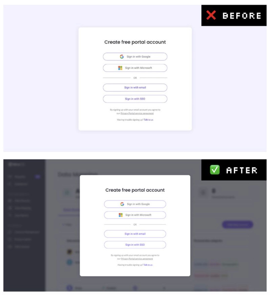
The original “How It Works” section used abstract visuals, which failed to give users a clear sense of what they would actually experience.

Insight
Industry case studies have shown that providing users with a preview of the next step can lead to conversion rate increases of up to 25%.
Solution
I replaced abstract visuals with real UI screenshots and dating imagery to help users clearly understand and emotionally connect with the experience.

Communicating Product Value Clearly
Problem
📝
The original session suffered from information overload, making the core message unclear

🎨
The illustrations failed to clearly communicate the product’s value.
design strategy
Highlight Ditto’s unique value through a clear, side-by-side comparison with traditional dating apps.

Design approach
What comparison would best showcase the product’s core value and make it instantly clear to users?
🕒
Time Comparison

📲
App Experience Comparison

💪
Effort Comparison

📝
Process Complexity Comparison

Final decision
I chose app experience as the comparison, since it aligns with users’ everyday behavior and minimizes the cognitive load needed to understand the message.


Final outcome

(Scroll to view👇)
Takeaway
🪄
Communicate brand value simply
Focusing on clarity and simplicity allowed me to translate Ditto’s unique value into visuals that users could immediately understand.
Tell the story from the user’s view
Reordering the page flow to match what users care about most—what it is, how it works, and what value it offers—led to a more intuitive and engaging experience.

