Design a straightforward and friendly experience for essential oils beginners to boost subscription rates.

Company
Yuanxin Tech.
Time
3 months, Oct 2023
Current State
Launched
Team
Product Designer (Me), Product Manager, Front-end Engineer

􀉚

Overview

Product Brief

􀫕

􀫕

Dr. Mom

📚

Encyclopedia of Essential Oils

Encyclopedia of Essential Oils

📱

Mobile App

Mobile App

Subscription-based

Subscription-based

􀆊

What are essential oils and recipes?

􀆊

What are essential oils and recipes?

􀆊

What are essential oils and recipes?

Business Goal

􁞸

􁞸

Increase the number of subscribers

Design approach

􀬁

􀬁

🛤️

🛤️

Pay more attention to previously overlooked user groups and provide an straightforward and friendly experience.

old Version

􀋭

􀋭

Final outcome

􀋭

􀋭

Imapct

􀐾

􀐾

+34.2%

User Satisfaction

+22.6%

Number of Subscribers

􁕦

problem Analysis

We have two key user groups, however…

􀉫

􀉫

The product mainly satisfied the needs of aromatherapist, while ignore the needs of essential oils beginner.

The product mainly satisfied the needs of aromatherapist, while ignore the needs of essential oils beginner.

Essential oils beginner

Essential oils beginner

User Need

Find the suitable oil or recipe for themselves

Find the suitable oil or recipe for themselves

User Satisfaction

😡

Aromatherapist

Aromatherapist

User Need

A comprehensive essential oil and recipe library

User Satisfaction

😃

essential oil beginners are important, because…

􀁞

􀁞

👭

Large Customer Base

74% none subscribers are essential oils beginner

74% none subscribers are essential oils beginner

👑

Key Potential Customers

Better experience could convert them into loyal customers

Better experience makes loyal customers

How might we…

􀛭

􀛭

💡

Provide a better experience for essential oil beginners to boost subscription rates.

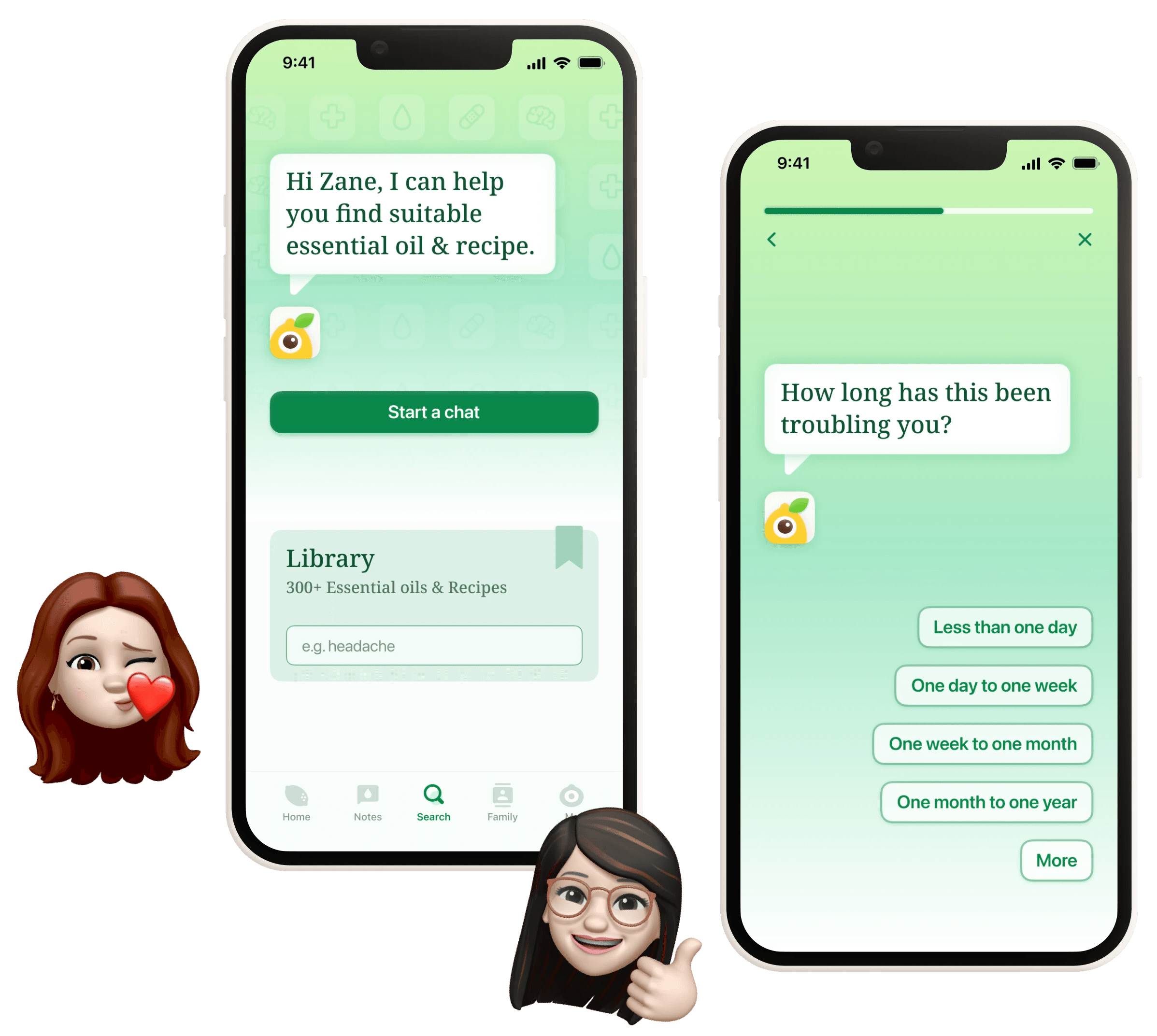
How's their current experience of finding recipe ?

􁇥

􁇥

So, What's happening?

􀺨

Based on user journey map, I summarized two pain points.

🤯

Pain point

Information Overload

🤔

Pain point

User Hesitation

Key findings

􁅇

􁅇

􀀺

􀀺

Essential oils beginner prefer easy and straightforward experiences.

Essential oils beginner prefer easy and straightforward experiences.

􀀼

􀀼

Beginner encounter difficulties with tasks they are not familiar with.

Beginner encounter difficulties with tasks they are not familiar with.

􀀾

􀀾

Beginner often seek someone to talk to when they encounter a health issue.

Beginner often seek someone to talk to when they encounter a health issue.

How might we…

􀛭

􀛭

💡

Provide a straightforward and friendly recipe finding experience for essential oil beginners?

􀠀

Challenge

Challenge

How can I craft an experience that meets the needs of two distinct user groups?

How can I craft an experience that meets the needs of two distinct user groups?

How can I craft an experience that meets the needs of two distinct user groups?

information architecture Analysis

􀛭

􀛭

The abundance of information across two pages is great for aromatherapists seeking access to resources. However, it can be overwhelming for beginners in essential oils.

The abundance of information across two pages is great for aromatherapists seeking access to resources. However, it can be overwhelming for beginners in essential oils.

exploration

􀛭

􀛭

I developed three versions of the IA to explore which one best meets the needs of both user groups.

version A

PROS:

  • Improved user comprehension

  • Reduced cognitive load

CONS:

  • Too many steps for Aromatherapist

  • Disrupted immersion

version B

PROS:

  • The least amount of friction

  • Provide a more relevant experience

  • Higher efficiency

CONS:

  • Higher design and development costs

version C

PROS:

  • Simplified design and development

  • Higher efficiency

CONS:

  • Cause information overload for freshman

  • Reduced scalability

Final version

􀟗

􀟗

A + B + C

  • Version A suits essential oils beginner, since it's simple and easy.

  • Version C suits aromatherapists, since they can easily overview all the information they need.

  • Version B could provide higher efficiency for both user groups.

  • Version A suits essential oils beginner, since it's simple and easy.

  • Version C suits aromatherapists, since they can easily overview all the information they need.

  • Version B could provide higher efficiency for both user groups.

What’s the best page to split flow ?

􀙠

􀙠

Health Issue Page

Health Issue Page

Homepage

Homepage

  • Beginners can access the feature designed for them easily and intuitively.

  • It has the least impact on the experience of aromatherapists.

  • Beginners can access the feature designed for them easily and intuitively.

  • It has the least impact on the experience of aromatherapists.

􀯭

Redesign the task flow of beginner

Which tasks can be finished easily by beginner?

􀯧

􀯧

Tasks about a user's own condition are easier, while those with knowledge gaps are harder.

  • Choose the recipes

  • Diagnose their health issue

  • Replace the essentials

  • Choose the volume of the recipe

  • Choose the recipes

  • Diagnose their health issue

  • Replace the essentials

  • Choose the volume of the recipe

  • Type their basic informations

  • Tell the symptoms

  • Choose the essential oils and equipments they own

  • Choose the usage they prefer

  • Type their basic informations

  • Tell the symptoms

  • Choose the essential oils and equipments they own

  • Choose the usage they prefer

Old task flow

􀖅

􀖅

New task flow

􀖅

􀖅

􀟝

Wireframe

which Interaction type works best for beginner ?

􁊿

􁊿

Browsing

PROS:

  • Information at a Glance

  • Self-Paced Exploration

CONS:

  • Not suitable for freshman due to the knowledge gap

Questionnaire-style

PROS:

  • Consistent layout lead to high efficiency

  • Progress bar can reduce user uncertainty

CONS:

  • Questionnaire-style feels like a test, lacks a human touch

Conversational

PROS:

  • Experience with empathy

  • Easy and engaging experience

CONS:

  • User has higher expectation of functionality

  • Low efficiency

A: Browsing

PROS:

  • Information at a Glance

  • Self-Paced Exploration

CONS:

  • Not suitable for freshman due to the knowledge gap

B: Questionnaire-style

PROS:

  • Straightforward step-by-step experience.

  • Progress bar can reduce user uncertainty

CONS:

  • Questionnaire-style feels like a test, lacks a human touch

C: Conversational

PROS:

  • Friendly experience

  • Easy and engaging experience

CONS:

  • User has higher expectation of functionality

  • Low efficiency

Browsing

PROS:

  • Information at a Glance

  • Self-Paced Exploration

CONS:

  • Not suitable for freshman due to the knowledge gap

Questionnaire-style

PROS:

  • Consistent layout lead to high efficiency

  • Progress bar can reduce user uncertainty

CONS:

  • Questionnaire-style feels like a test, lacks a human touch

Conversational

PROS:

  • Experience with empathy

  • Easy and engaging experience

CONS:

  • User has higher expectation of functionality

  • Low efficiency

Usability test

􀎞

􀎞

key findings

􀬁

􀬁

Users appreciate the straightforward nature of questionnaire-style interactions. However, they also prefer conversational interactions for the friendly experience they provide

Users appreciate the straightforward nature of questionnaire-style interactions. However, they also prefer conversational interactions for the friendly experience they provide

Users appreciate the straightforward nature of questionnaire-style interactions. However, they also prefer conversational interactions for the friendly experience they provide

Final interation type

􀇺

􀇺

B + C (Questionnaire-style + Conversational)

B + C (Questionnaire-style + Conversational)

Straightforward and friendly experience

Straightforward and friendly experience

lo-Fi Wireframe

􀎞

􀎞

􀑉

Takeaway

🎁

🎁

Fully understand user needs and designing a coherent task flow are pivotal to the entire product.

Comparing product design to building a house, user needs are the foundation, while the task flow is the framework.